
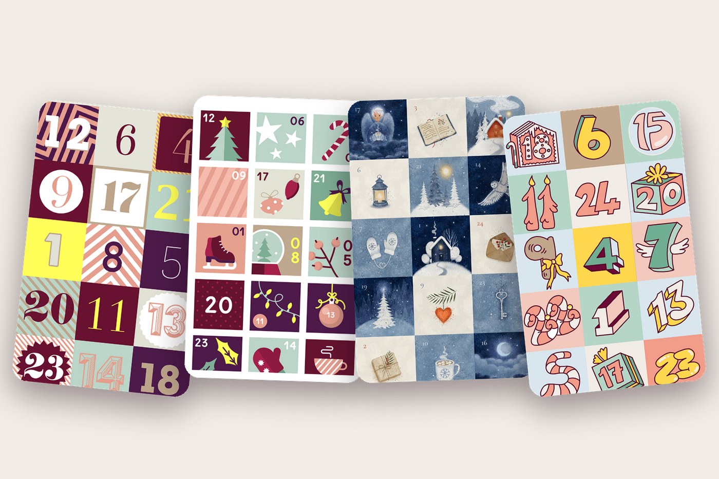
Every calendar in the Advent App starts with a design: 24 closed doors that set the mood before a single one is opened. Since 2013 we have shipped nine of them. Behind the four we love most are four illustrators – this is their story, and you can open a door from every design right here on this page.
A quick note on the demos: tap any door below and it opens exactly the way it does in the app, with the same timing and the same choreography. Only the sound is missing – each design has its own chime, and you'll have to open the app for that.
Classic (2013): the design that became the app
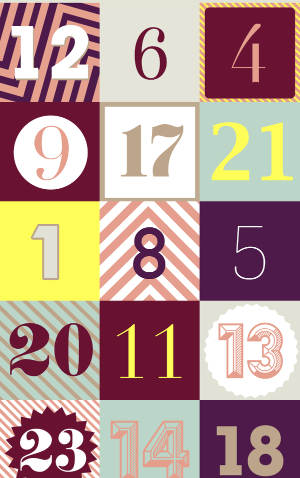
When Advent App launched in 2013, it had exactly one design, and for almost a decade that was the whole point. Our co-founder Susa Fill drew it: 24 little typographic posters in wine, salmon, plum, mint and a burst of lemon yellow, every number set in a different display face on stripes, chevrons and rosettes. It looks less like a Christmas calendar than a poster wall, and that was deliberate. Christmas is in the ritual of opening a door every morning; the doors themselves could be art.
Classic is also the app's brand. The gift-box icon, the wine that runs through the interface, even the colours of this website all descend from Susa's palette. Whenever we add a design, the first question is still "does it live in the same house as Classic?"
The opening: page curl. The door peels up from its bottom edge like a real page – the same transition the very first version used.
2023: a little more Christmas
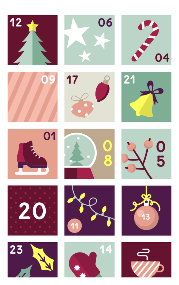
After ten seasons of one design we asked ourselves whether the app could carry a second one without losing its face. Illustrator Nele Waibel got a brief that fit on a napkin: more Christmas, same app. Her answer is a set of flat, friendly icons – ice skates, a snow globe, a candy cane, fairy lights, a steaming mug – drawn in exactly the Classic palette, so the two designs read as siblings rather than rivals. It was the first time the app felt unmistakably festive at a glance, and it quickly became the choice for family calendars.
The opening: roller blind. The door rolls up like a blind, and it starts to snow.
What you told us
With two designs in the app we started asking people which one they preferred. The answer was surprisingly consistent: both – and could there be more? Some wanted something warmer and more painterly for a partner or grandparents; some wanted something louder and more modern for friends and kids. So this year we did something we hadn't done before and worked closely with two illustrators at once, with two opposite briefs.
Nordic: Lena Refur's winter night
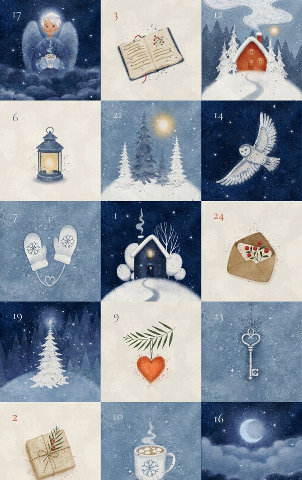
Lena Refur paints in watercolour, and you can see it in every tile: the paper grain, the soft bleed of the night blues, the tiny flecks of white snow. A snowed-in cabin with a lit window, an owl in flight, mittens on a string, a lantern, a mug of cocoa, a key, a letter with a sprig of berries. The set alternates between deep night-blue and warm cream cards, with the day numbers in a quiet old-style serif – it is the calmest design in the app, and the one people describe as "cosy" most often.
Lena's portfolio: behance.net/lenarefur
The opening: nightfall. The door darkens into a night sky, stars wake up, a shooting star crosses – and dawn lifts the night from the bottom.
Modern 2026: Annika Brandow's comic numerals
Annika Brandow went the other way entirely. In her set the numbers are the picture: a 6 extruded into a chunky 3D block, a 7 with wings, a 2 bent from a candy cane, an 18 baked into a gingerbread house, an 11 as two burning candles. Everything is drawn in a thick plum ink line on pastel grounds – coral, butter, teal, blush, sky and mint – and the grid is laid out so that no two neighbouring doors share a ground. It is the loudest design we have ever shipped and the one that makes people grin when they swipe past it in the carousel.
Annika's portfolio: behance.net/shimmy
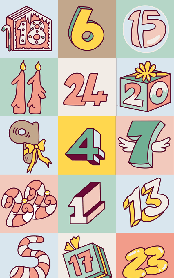
The opening: comic pop. The door wobbles, squashes and bursts – starburst, speed lines, confetti.
The variants
The other five designs in the carousel are variants of the ones above – the same grids and the same palettes, pushed in a new direction. We developed them in-house, partly with the help of AI tools, and each one got its own opening animation.
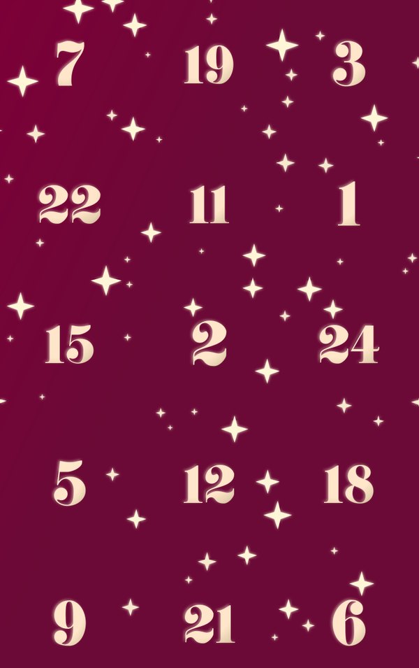
Classic 2026Classic's wine, as a starry night 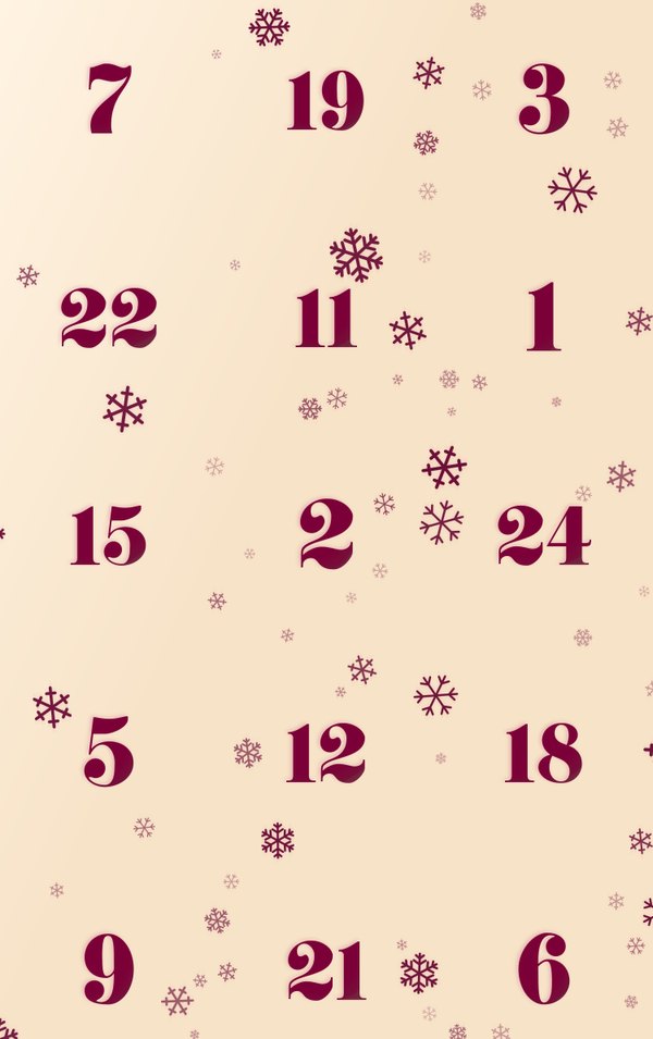
SnowflakesThe same design, inverted 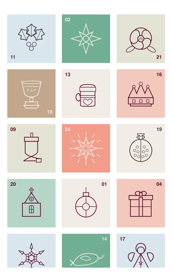
2026Nordic folk, woodcut style 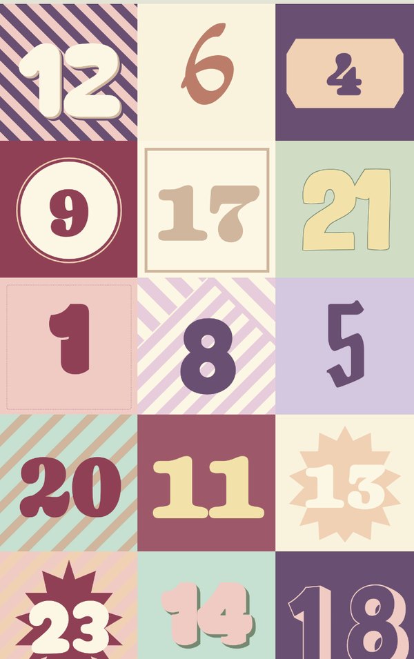
2028Classic in pastel 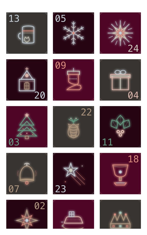
2029Neon on black
Pick one and open its door:
The opening: star shine. A star charges up over the door and flares – the door melts away in its light.
How the carousel is ordered
If you have ever wondered why the designs sit in the order they do when you create a calendar: Classic stays first because it is the default and the face of the app, 2023 follows as its sibling, and Modern 2026 sits on the third slot as the wake-up call. From there the cards get darker card by card – pastel, cream, night-blue, wine, black – so that each design leads into the next like pages in a book.
Frequently asked questions
Where do I choose the calendar design?
When you create a calendar, the second step is "Pick a design". Swipe through the card carousel and tap the one you want. Classic is the default.
Do the designs look the same on iPhone and Android?
Yes. Both apps ship the identical artwork, the same grid order and matching door animations, so the calendar you send looks the same on the recipient's phone whatever they use.
Does every design have its own door animation?
Yes. Each of the nine designs opens its doors differently – a page curl, a roller blind, a night sky, a comic burst – and each has its own chime timed to the animation.
Who drew the designs?
Classic was drawn by co-founder Susa Fill for the 2013 launch. 2023 is by illustrator Nele Waibel. Nordic is by Lena Refur and Modern 2026 by Annika Brandow, both new for this season. The remaining five designs are variants of existing ones that we developed in-house, partly with the help of AI tools.
Thank you, Susa, Nele, Lena and Annika
Four illustrators, thirteen years, nine designs. A digital advent calendar is only as good as the anticipation it builds, and these doors carry a lot of it. If one of them made you smile, the next step is easy: pick it, fill 24 doors with your own photos, videos and voice messages, and send the link.